
ClinicalKey Discovery
Elsevier wanted to evolve ClinicalKey — described by users as “Google for doctors” — from a searchable content library into a tool that supports rapid point-of-care decisions and deep research, without alienating the existing research base. As Principal I ran rapid Discovery and Delivery validation with hospitalists and residents, supporting 80+ clinician interviews in six months.
Working in two-week sprints, I ran concurrent qualitative studies — 8–10 clinicians per round, 45-minute interviews with task scoring. I framed everything around the physician's shift as the common denominator, mapping the tasks and decisions around a real patient case. The single KPI was speed to answer.
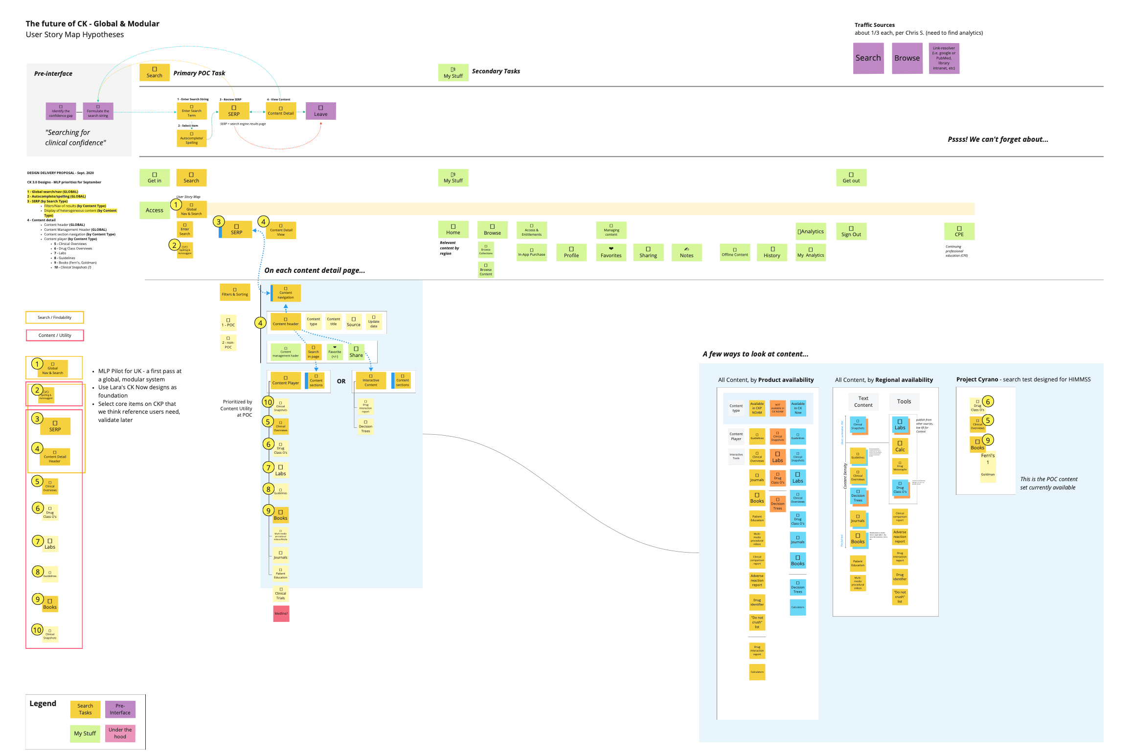
I built the first test on a point-of-care product already in flight for non-North-American markets, reusing the CK Now library so we could validate real designs fast. Three directions competed head-to-head — “Less is more,” “Color & Contrast,” and “Picture = 1,000 Words.” The visual, pill-driven direction won decisively, then went through a second optimization round designed alongside internal clinicians.
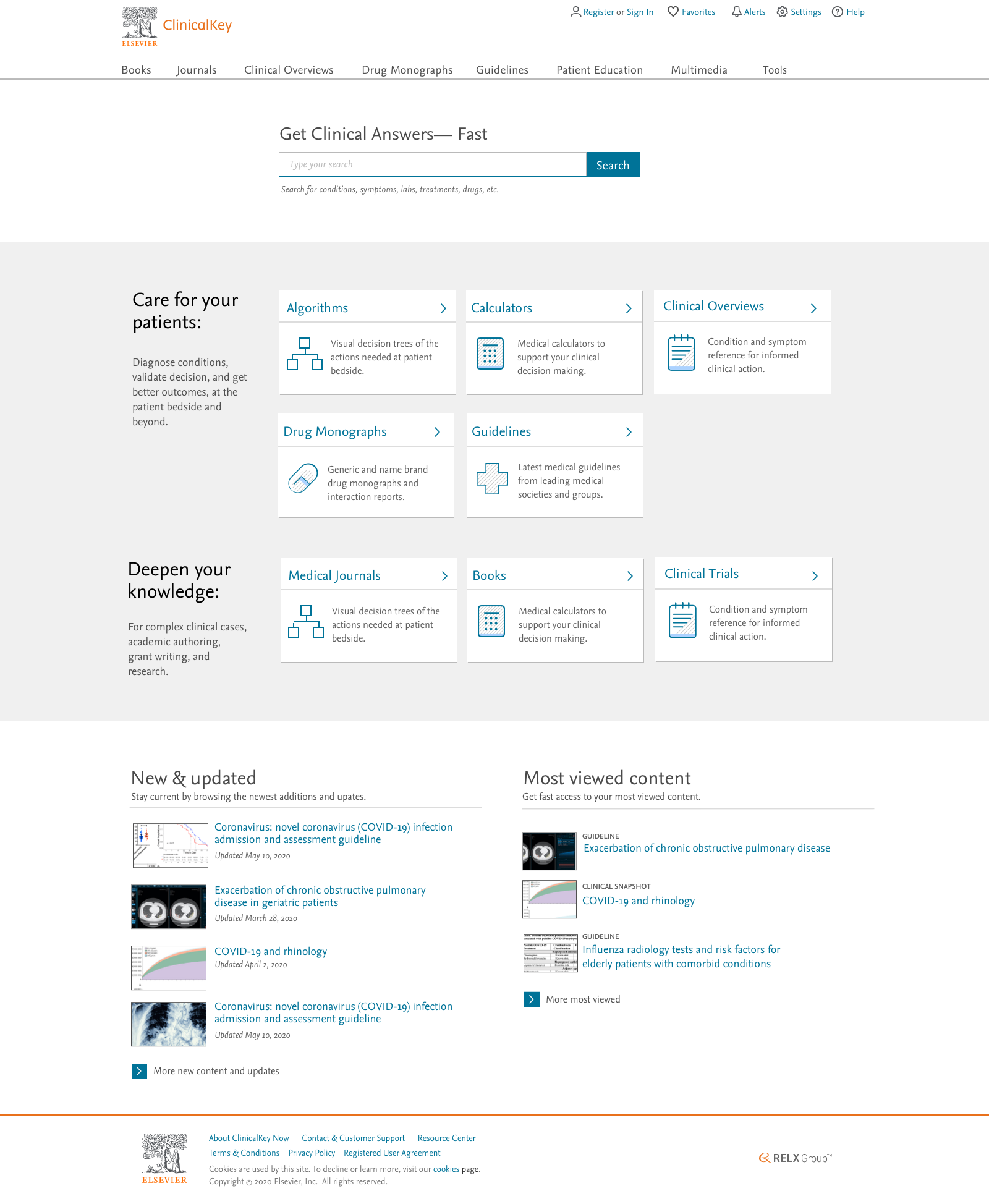
A responsive app surfaces point-of-care content at the top of every result. POC “pills” act as jump points into Diagnosis, Workup, Management and Drugs — answering the need for speed and using high-contrast color to hook muscle memory. The typeahead and search-results page lean on visuals to cut time to answer.
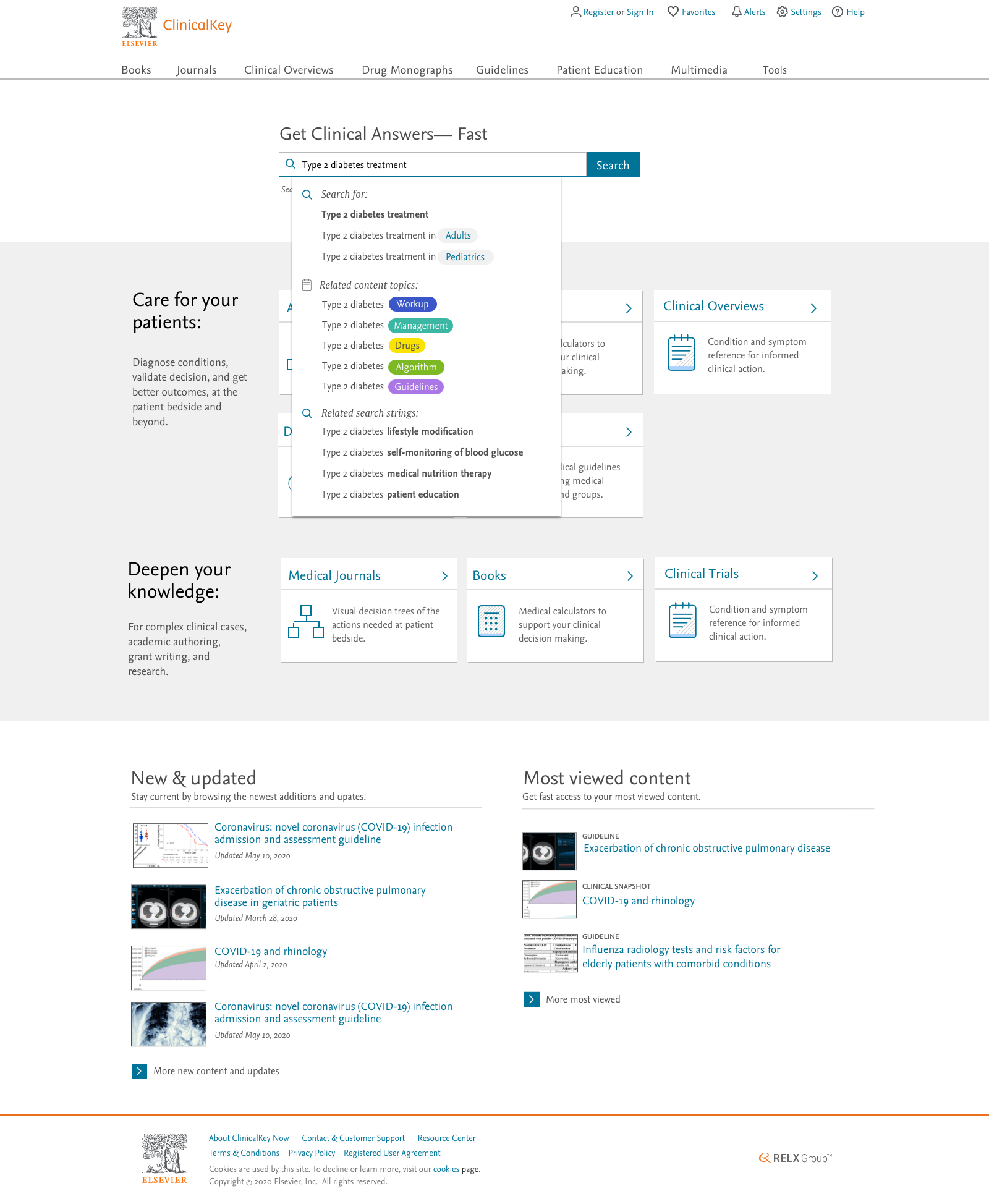
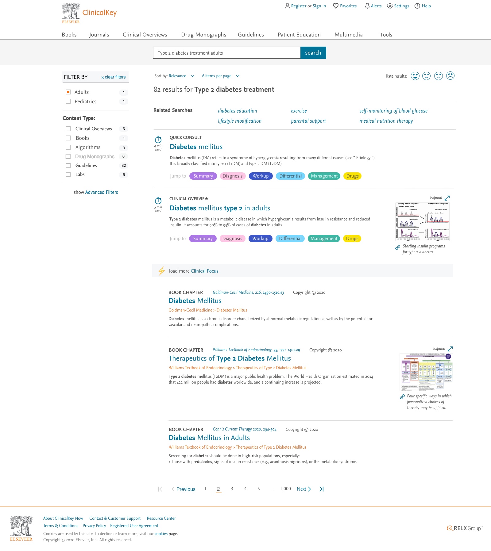
“Oh my god, you read my mind. Look at those pills. I would use those every time.”
When you research & design with domain experts the app practically designs itself.
Surgical Tracker
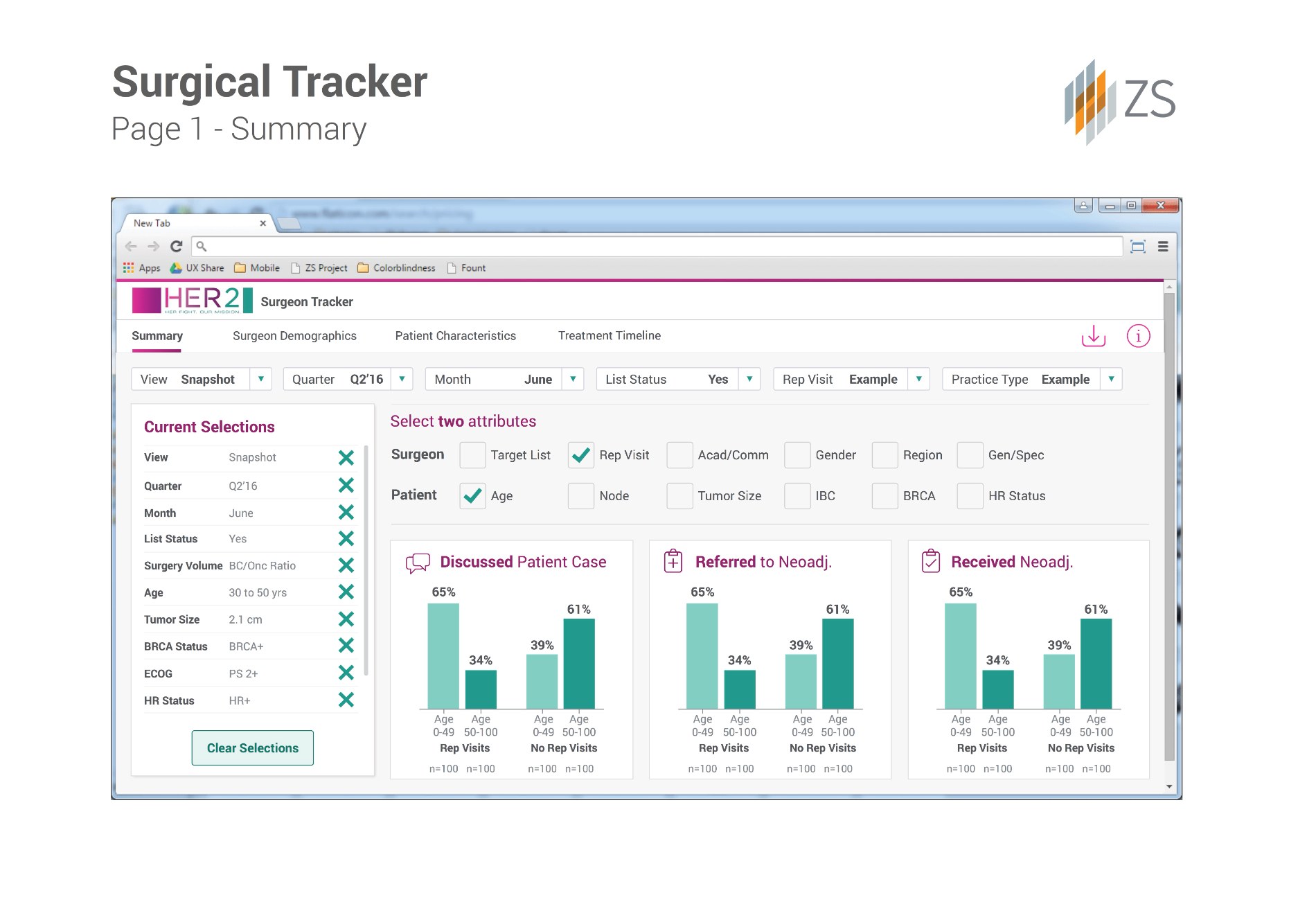
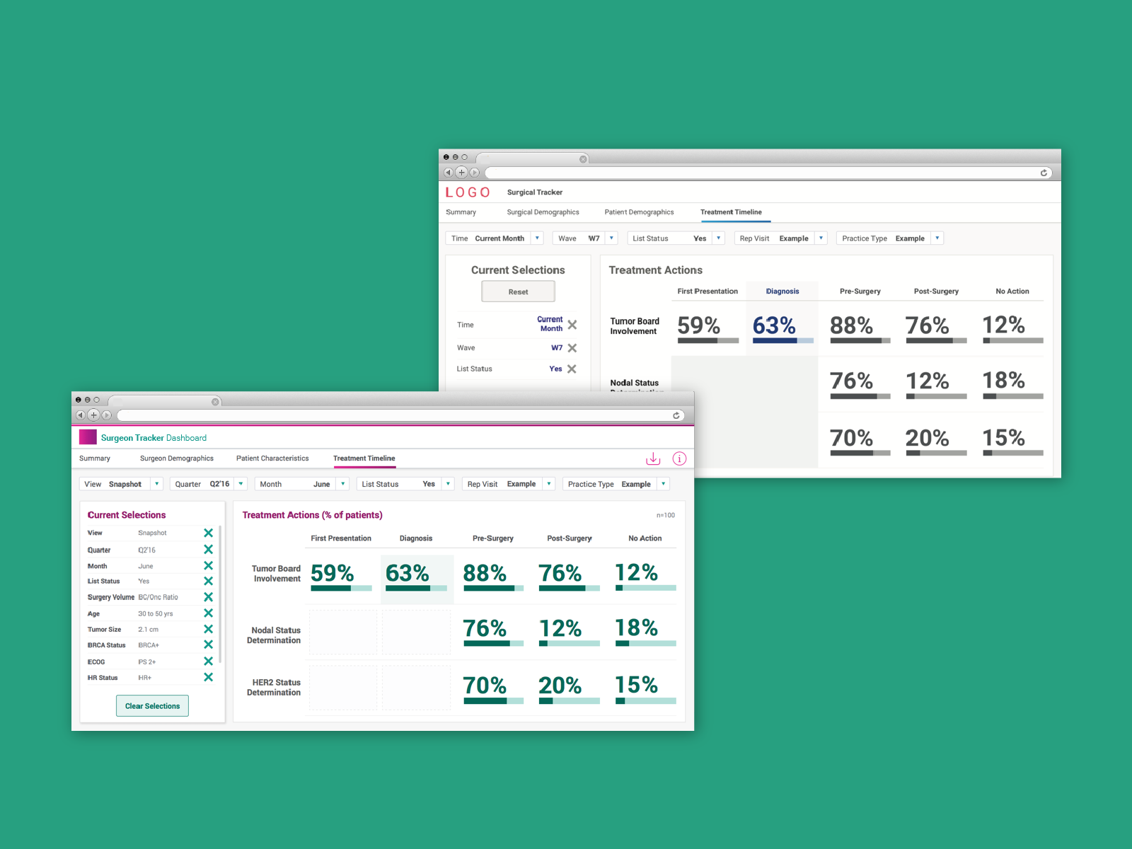
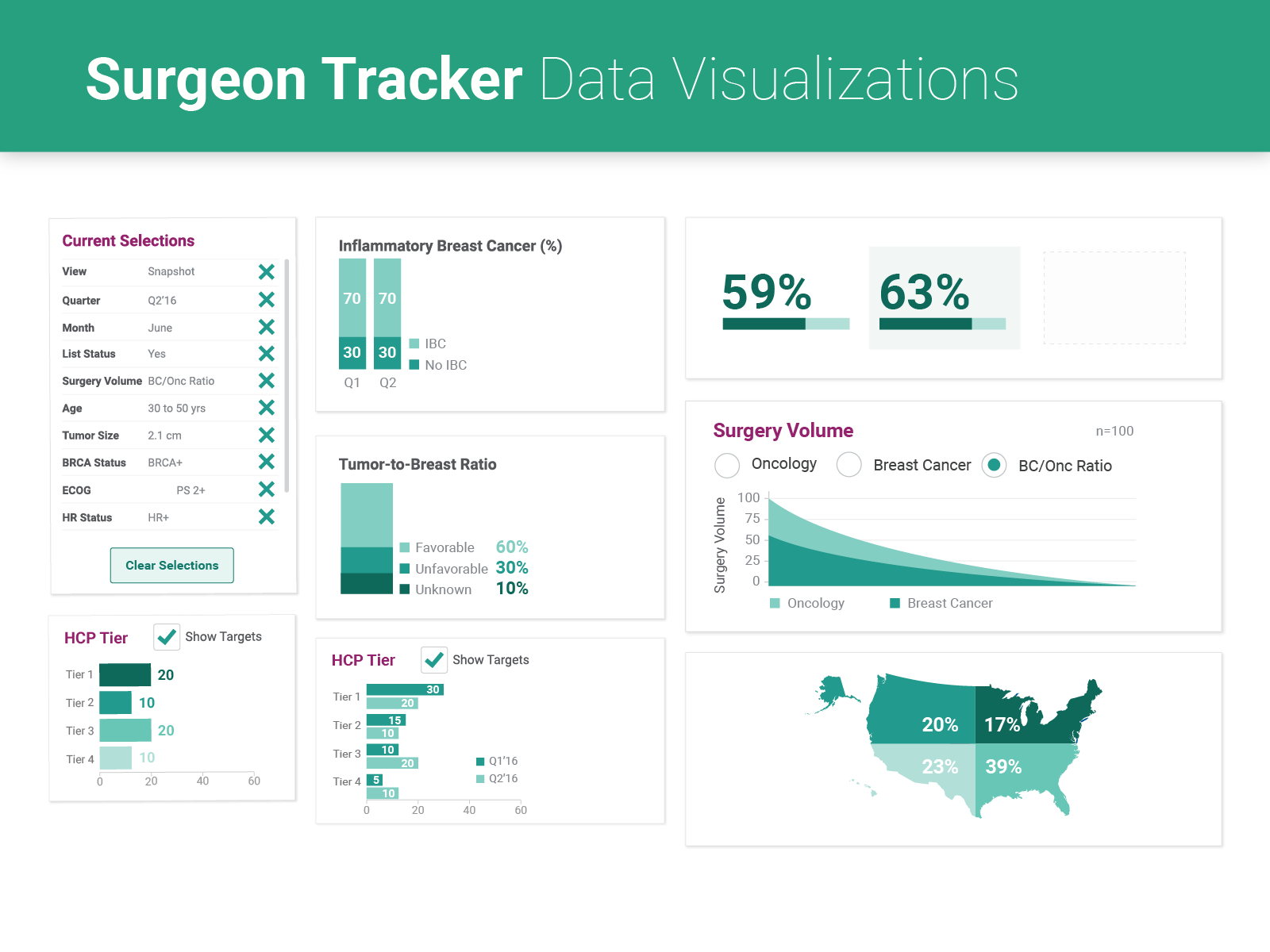
A business-intelligence dashboard that lets the client filter 13,000+ records to analyze patient outcomes for any sub-population of variables. C-level executives and managers needed to sort large volumes of data quickly across 30+ variables — while non-technical users kept up. Filter selections had to carry forward, stay visible, and be editable from any view.
The product served two audiences at once: technical analysts who think in variables, and executives who need the headline. I led the research and analysis to map the analysis path, then designed controls that supported deep filtering without ever forcing a user off the screen they were reading.
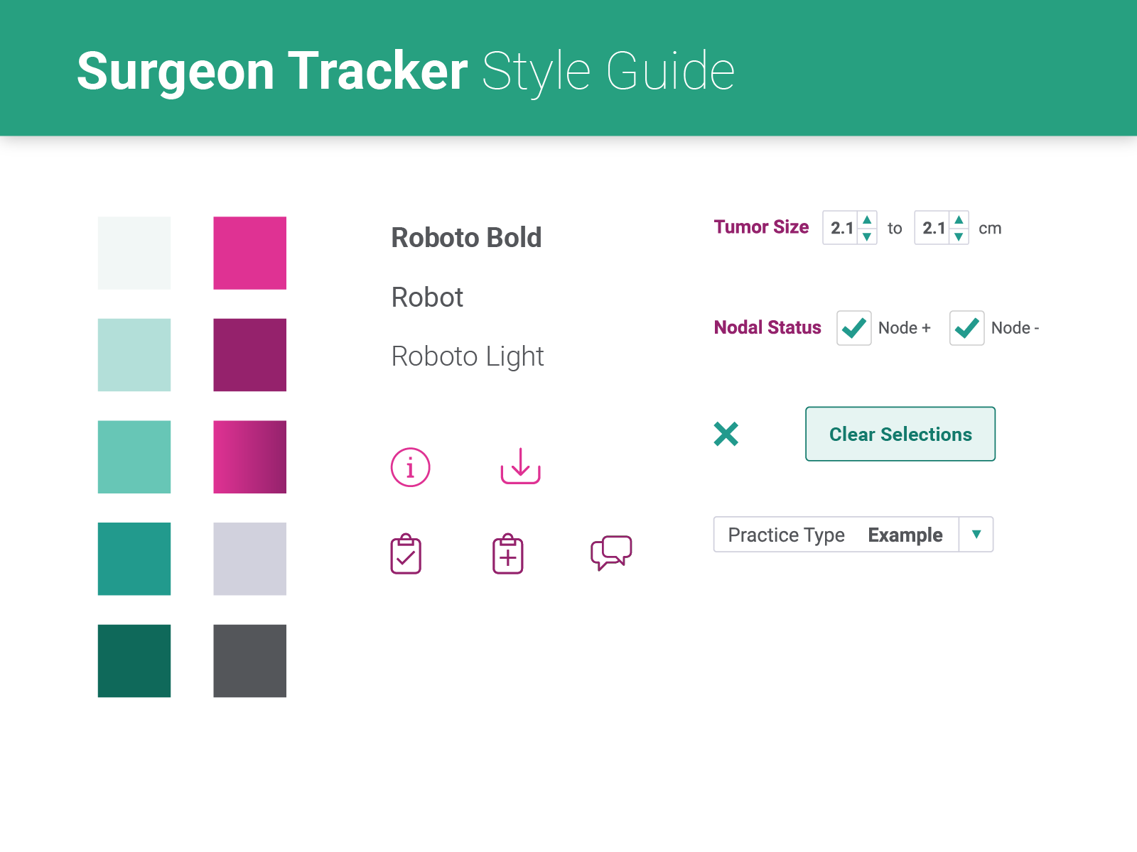
Rough sketches from remote collaborative sessions with the internal consulting team became the dashboards we iterated with the client. We deliberately started in grayscale — a placeholder logo and neutral bars — so the team focused on the data and controls before we layered in brand color.
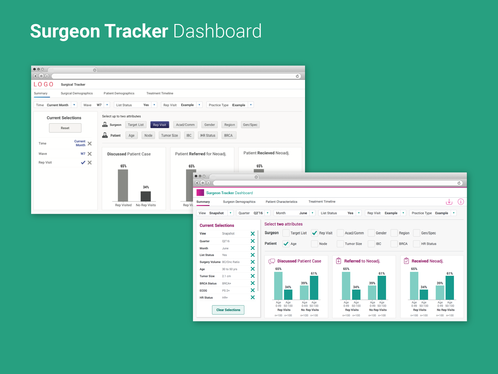
An editable left-rail filter widget keeps many variables referenceable and editable without navigating away; view-specific selectors appear only where they apply. Brand colors were optimized for colorblind users and applied carefully to highlight benchmarks and current performance, and simple icons speed comprehension across content areas.
“We've never had this level of insight or control over our data before. It's a transformative improvement.”
Complex data doesn't demand a complex interface.
It demands precision.
Field Assistant
After a phase-1 prototype proved the concept, the board approved full development of a context-aware assistant for pharmaceutical sales reps, first-line managers and brand managers. We designed a core app with add-on features for specific user groups, headed to market in 2018.
Reps spend enormous time finding, synthesizing and sharing data — work they weren't hired for, and a real source of frustration. Available data lagged 4–6 weeks, so teams couldn't respond to territory trends. And because reporting tools lived on laptops reps didn't carry, data was logged roughly every two weeks — late, incomplete and inaccurate.
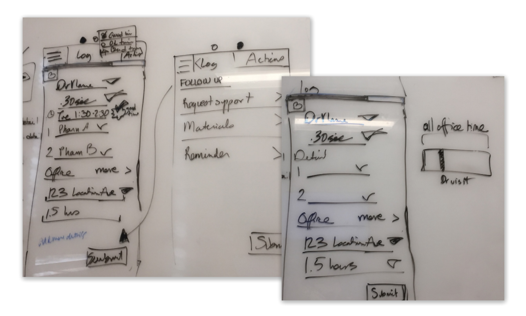
First sketches came out of collaborative sessions with the Content and UX teams; I refined them to validate with internal stakeholders. We designed the core experience first — the screens common to every user — then layered interactions specific to each user group's primary tasks and goals.
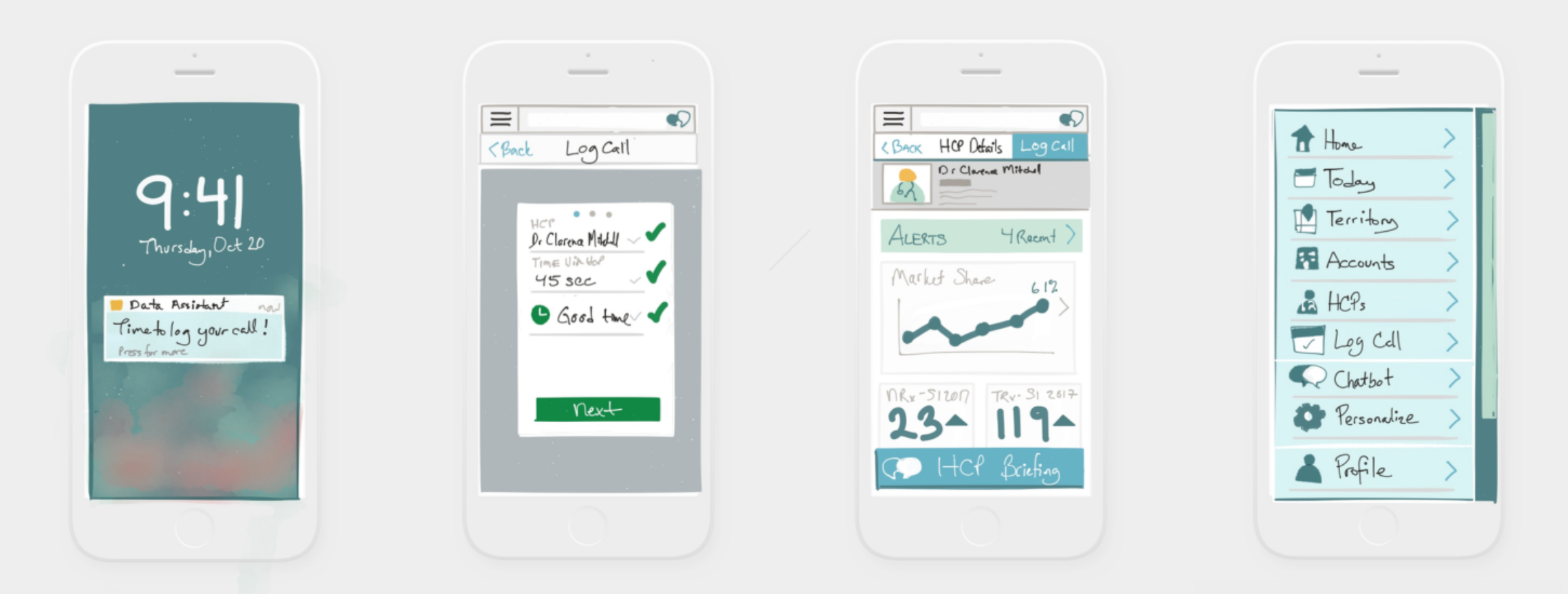
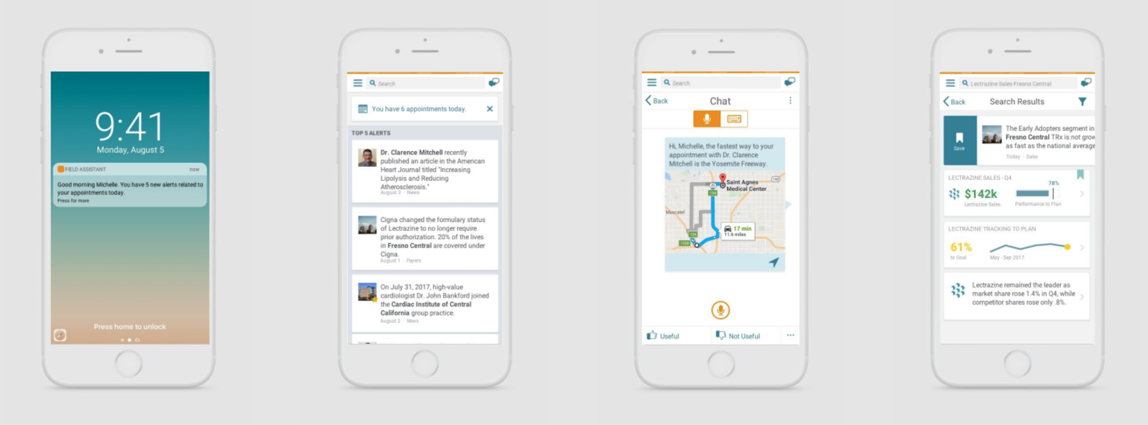
A mobile iOS app with a newsfeed of account, HCP and territory insights. A voice-activated chatbot lets reps ask about their territory, log and rate calls, and share updates hands-free. Location-, time- and calendar-relevant reminders deliver support in the right place, at the right moment.
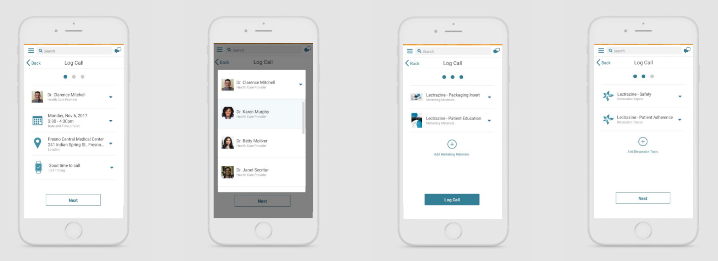
“I loved how quickly we aligned on design concepts and requirements in the UX workshop.”
The best design solutions feel invisible, even inevitable, when truly fit to the context and purpose.
Pure Good Skin Food
Pure Good, a vegan, food-grade skincare company, needed design across products, packaging, print and digital. We worked in Agile partnership with a small team of formulary experts to optimize the product for efficient manufacturing, reduced environmental impact, and ease of use for the entire customer relationship.
The target customer is a conscientious consumer who'll pay more for thoughtful, minimalist design that backs the value proposition — vegan, eco-friendly, food-grade fresh, micro-batch. But the oil-wash ritual is unusual; research showed users were unsure how to use it and anxious about “doing it wrong.” Packaging had to stay simple and efficient to cut cost and waste.
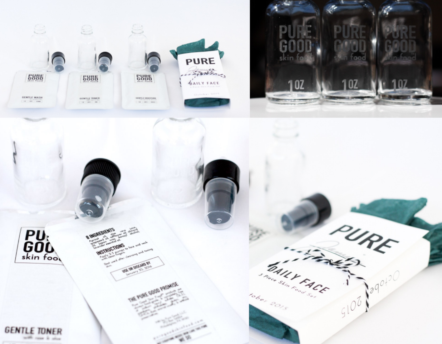
The Daily Face set ships with reusable, branded bottles; refills arrive in heat-sealed packets, each personalized with the recipient's name to keep the experience artisanal. One-color printing on standard sizes cut cost and assembly time. A friendly illustrated infographic primes expectations and reduces anxiety, and the responsive store minimizes steps to purchase.
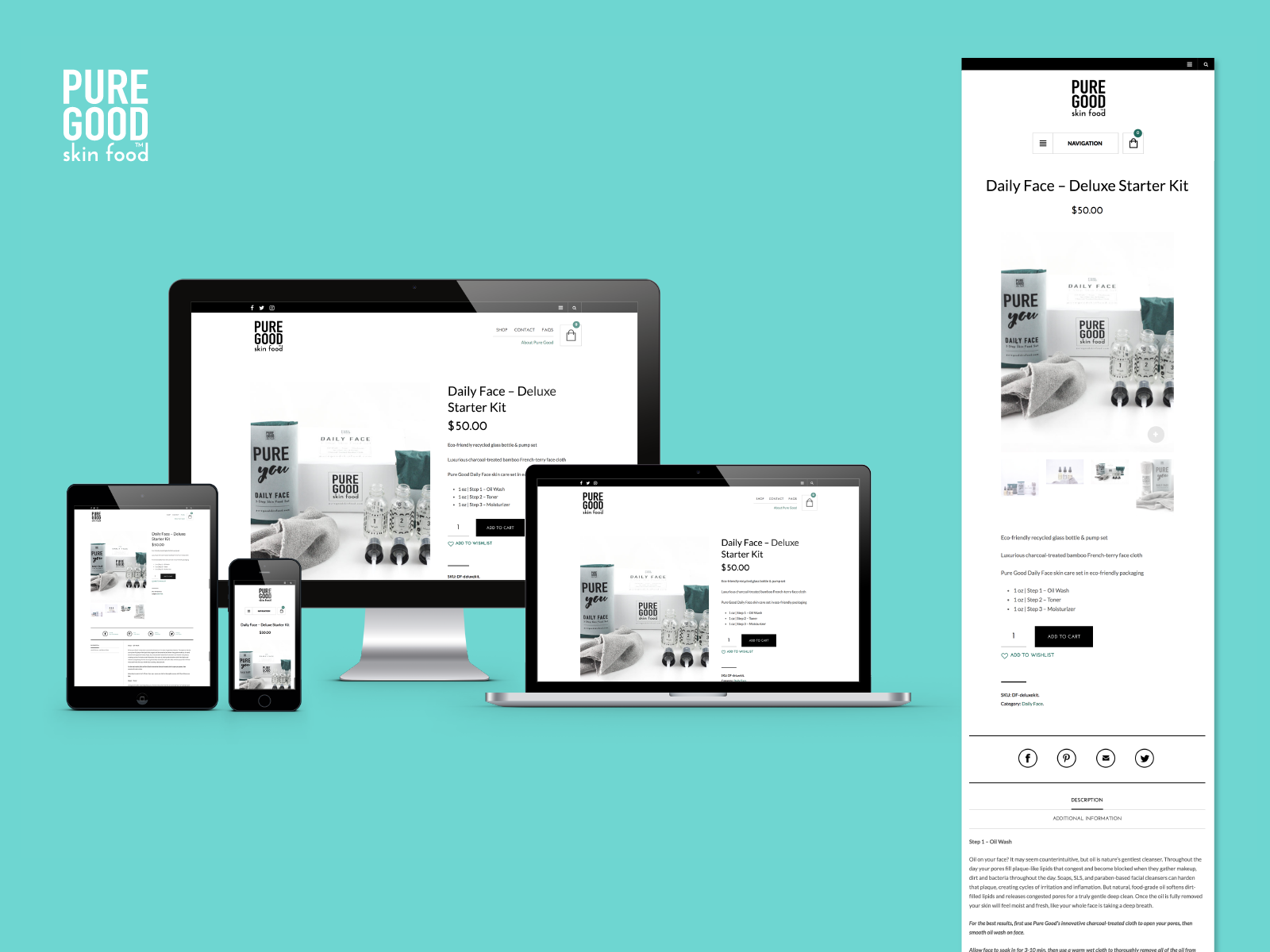
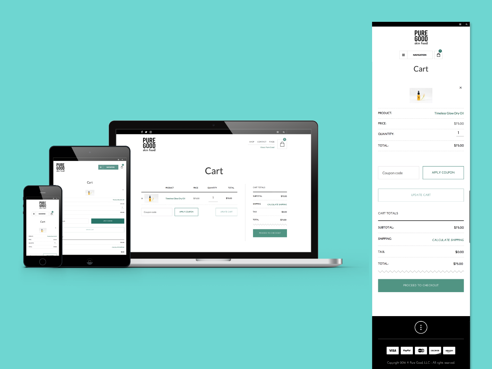
Embracing constraints creates opportunities.
Tradjenta / Jentadueto
The brand team wanted a pitch for a combined HCP-and-patient site that would establish them as a digital innovator in diabetes oral medications. They were recovering from a failed diabetes social network, which made them deeply risk-averse — big plays were off the table, so economy was essential. They were also attached to a “sign” metaphor from the existing site.
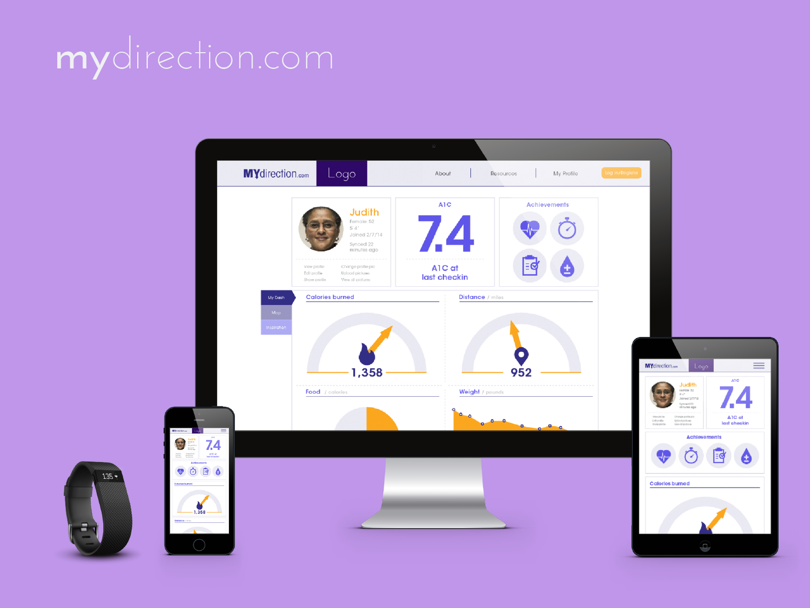
Patient engagement is the key lever in diabetes intervention. The rising prevalence — and falling cost — of activity trackers created an opening for HCP–patient engagement that supports optimal outcomes.
I wove patient personas through both the HCP and patient sites, creating natural conversation starters between clinicians and patients around therapy consideration — respecting the team's risk-aversion while still moving them forward. Personas spoke to specific brand differentiators around being Seamless, Simple and Safe.
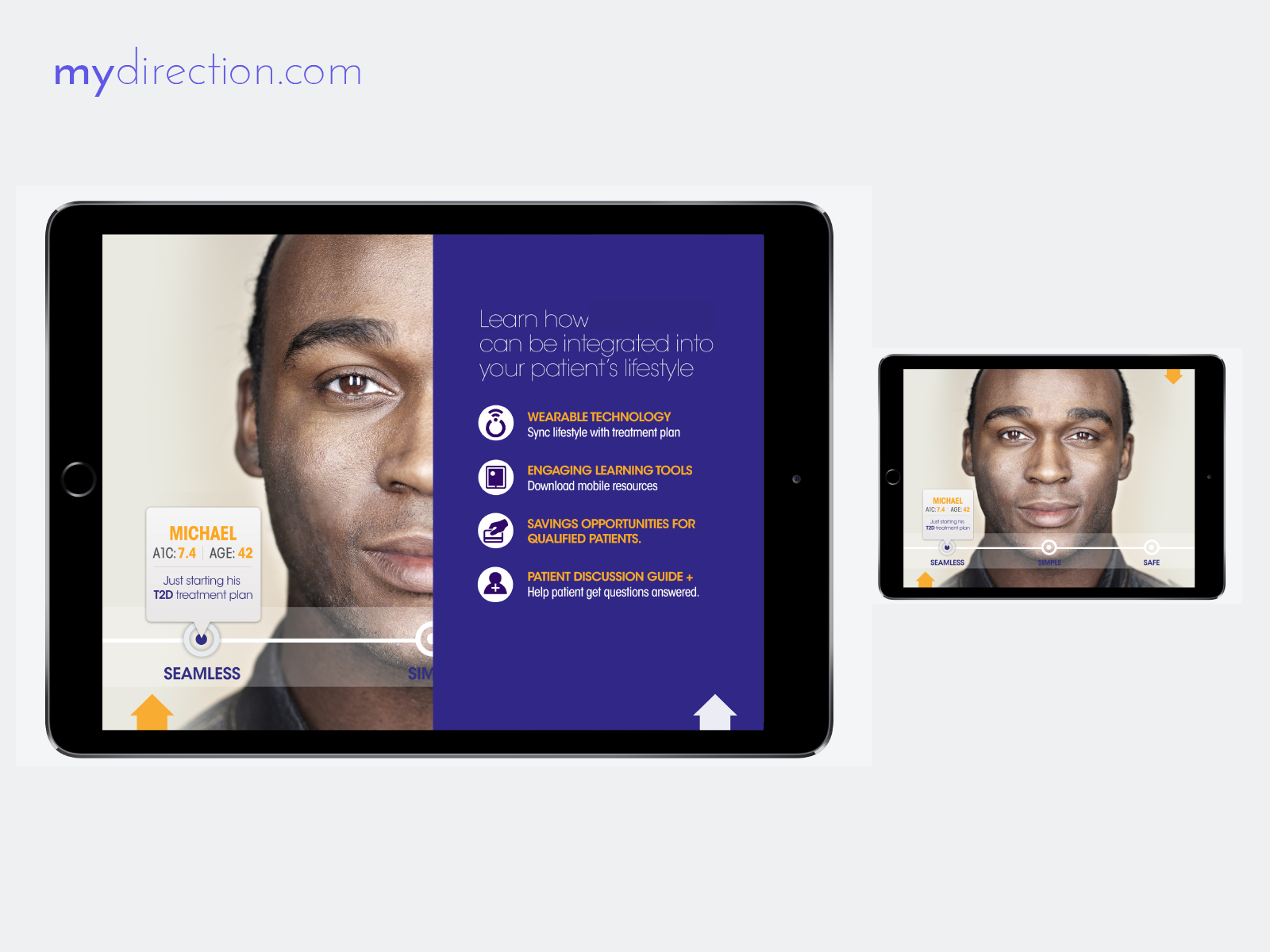
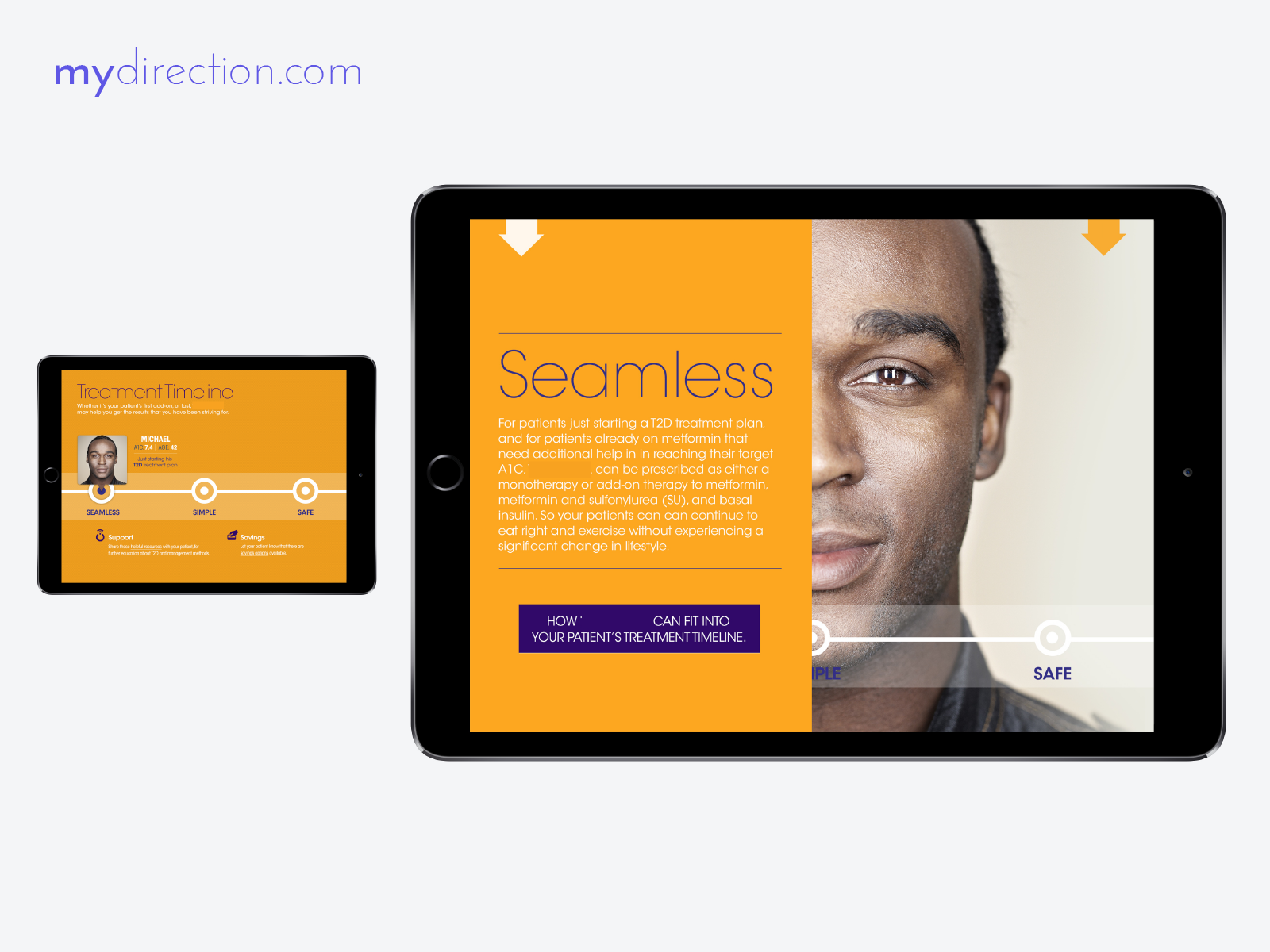
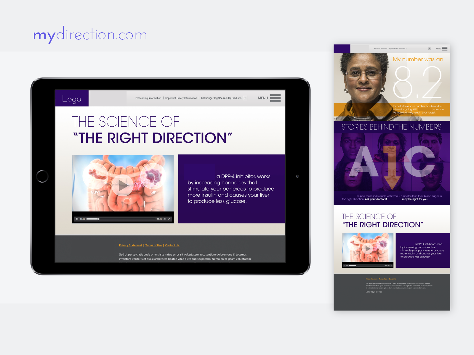
Personas link deep into the research findings that support each therapy claim. Fitness-tracker integration lets patients monitor the impact of diet and exercise on A1C and share data with their care providers. The Seamless / Simple / Safe framing carries through the HCP landing page, patient dashboard and resources.
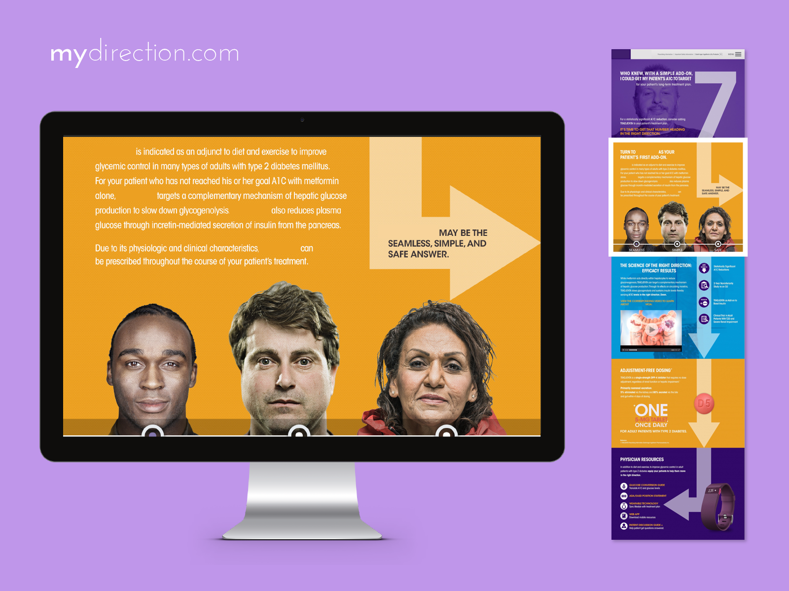
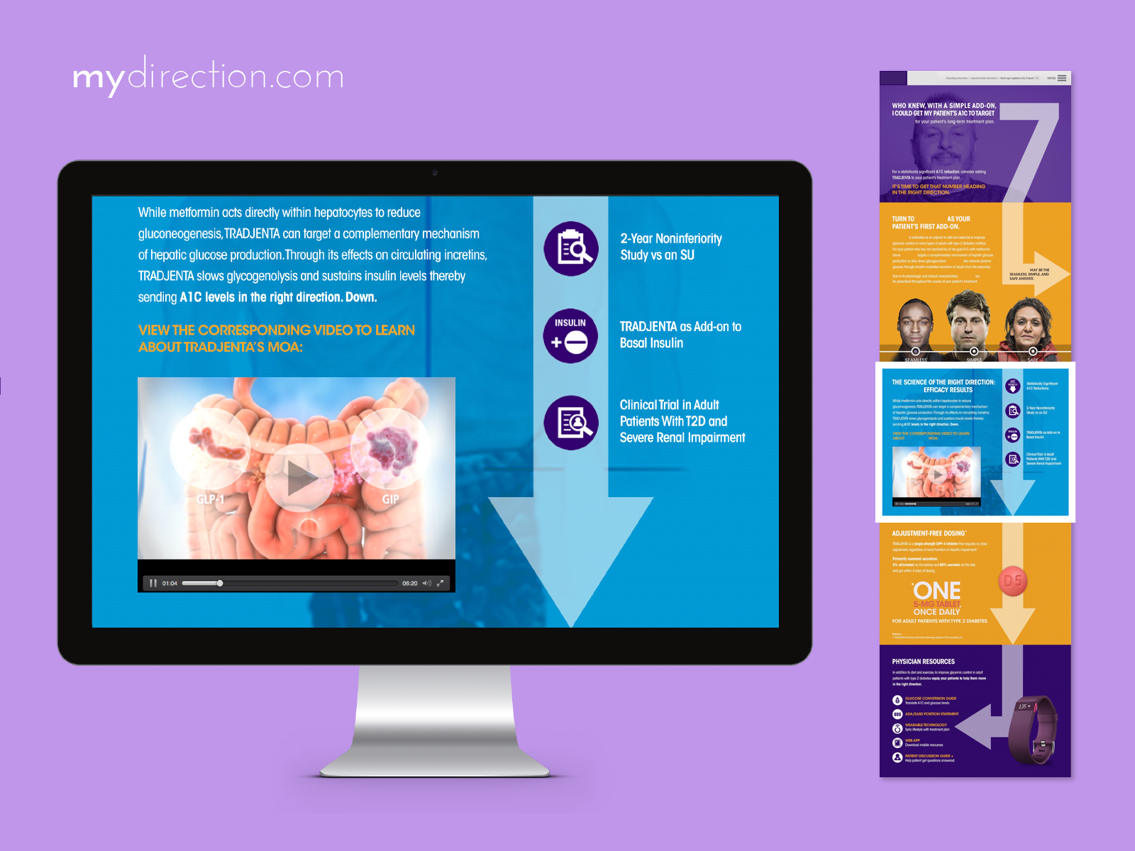
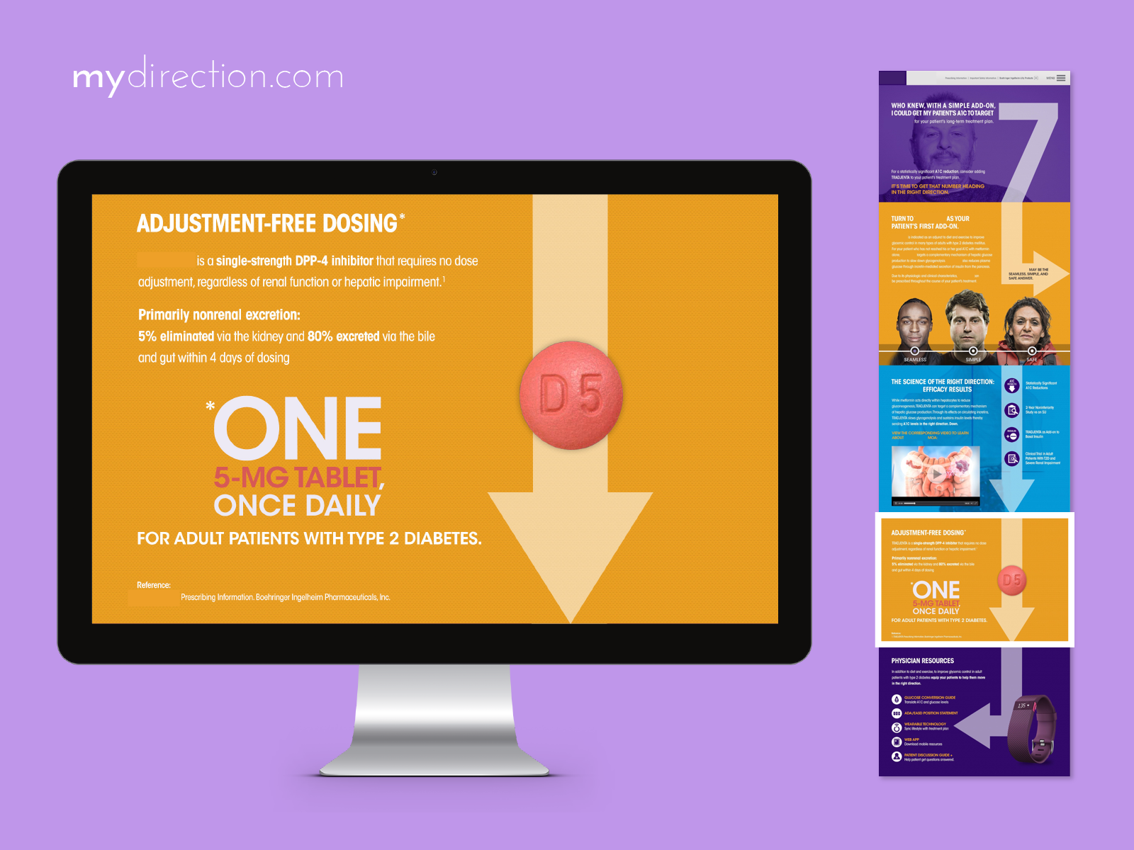
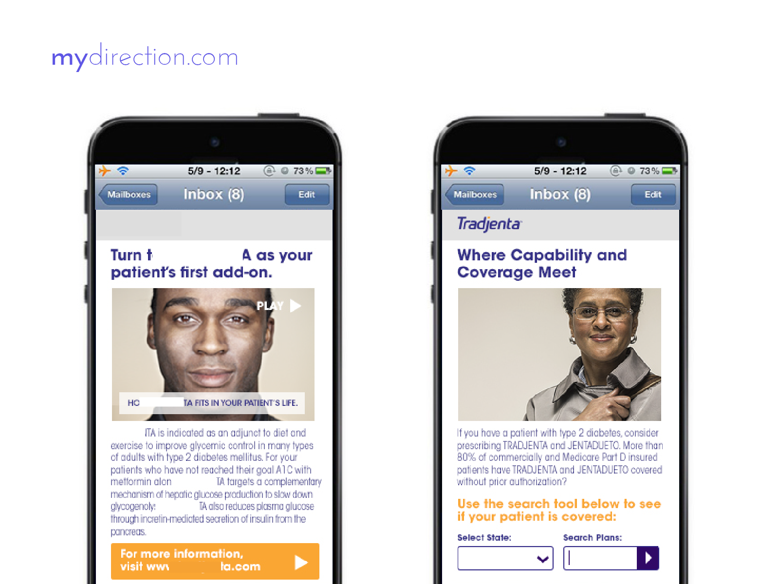
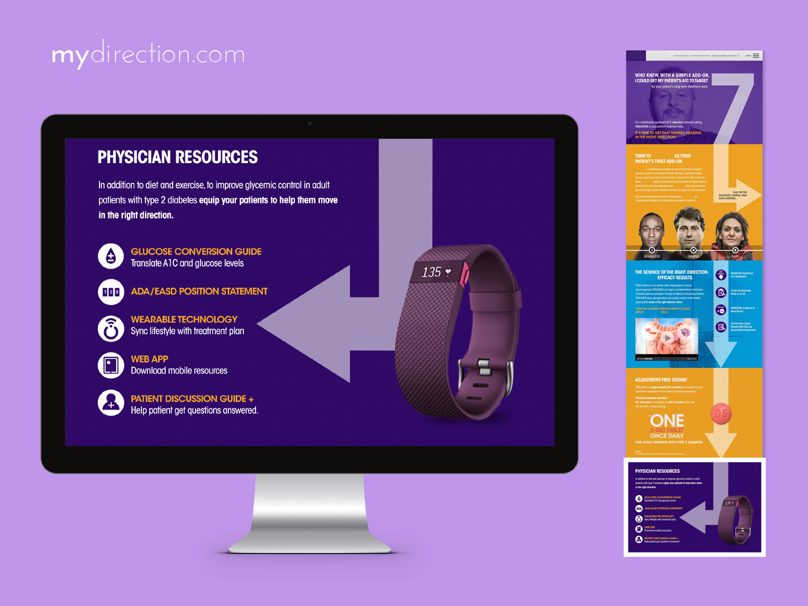
MedTech design is at its best when it highlights the human within healthcare.
CircleThrice Portal Redesign
CircleThrice is a membership platform for astrological planning. Its member dashboard had grown into a 13-item navigation with no hierarchy — everything weighted equally, nothing pointing the way in.
Worse, content was siloed by type — Library, Rites, Planners — rather than by the thing members actually orient around: astrological time. Finding “the right file for today” meant hunting across categories that didn't match how members think.
The cost landed on the highest-tier members ($45–$225/month), who churned on friction and an unclear sense of value. The root issue: no temporal spine, and no obvious path for someone arriving for the first time.
I opened with a heuristic analysis and UX critique of the current portal, plus a stakeholder survey, to separate symptoms from the core problem.
I framed the findings to the client as a revenue opportunity, not a cosmetic fix: better orientation drives engagement, engagement drives retention, and retention drives upsell.
The strategic move was to stop organizing by content type and start organizing by astrological time — and to define member archetypes, by engagement surfaces and behavior.
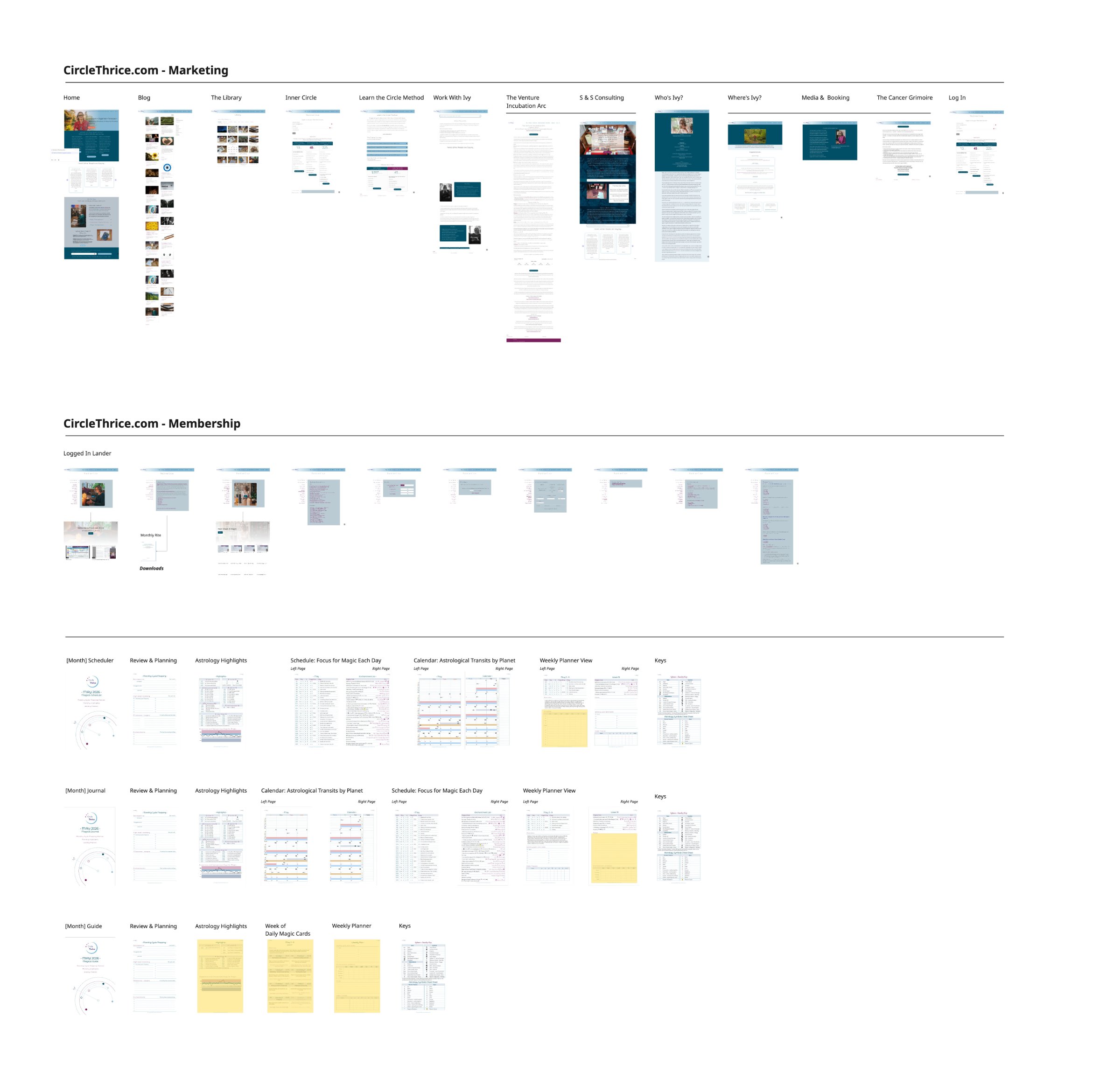
The foundation of the whole engagement: a full lifecycle study that told us where the experience leaked before we touched a single screen — synthesized fast, in partnership with AI.
I mapped the member lifecycle end-to-end, from first contact to referral, layering actions, touchpoints, emotions, and gains onto every phase. Claude synthesized scattered qualitative notes from myself and the founder, stakeholder survey responses & field study images, and the site & content audit into a formal seven-phase journey map — roughly a week of Figma work compressed into about an hour — which freed me to interrogate the findings instead of formatting them.
Synthesis surfaced three structural gaps — and those gaps, not a style refresh, became the redesign brief:
Blog content lived outside the member experience — siloed from the journey it should feed.
Library categories were topic-based, not temporal — misaligned with how members actually plan.
A steep learning curve with complicated wayfinding presented onboarding challenges, so new members never found their footing before churn.
From 13 undifferentiated nav items to seven clear, purposeful sections.
From PDF-primary downloads to responsive HTML — mobile friction eliminated.
From “search the library” to contextual, astrologically-relevant recommendations.
From no clear entry point to “Today” as the default landing.
Before a single screen was drawn, I modeled the system as objects. If the objects are right, the screens design themselves.
I used OOUX (Object-Oriented UX) and Sophia Prater's ORCA process to define the real nouns of CircleThrice — and to prove the “organize by time” thesis structurally, not just visually. Every object is documented across four dimensions:
The real-world nouns members care about — Day, Transit, Auspice, Planet, Rite, Session. The system's vocabulary.
How objects connect — a Day has many Transits; an Auspice is derived from a Planet. The nested structure of content.
What a member (or the system) can do with each object — view the day, save a transit, compute the hours.
The content and metadata each object carries — the fields that render on a card, a rail, a full page.
The map resolved to 18 objects across five clusters. Two things fell out immediately: the primary navigable objects (the ones that anchor a screen), and a shared attribute schema that pointed to a reusable base object — the seed of the design system.
- Day
- Transit
- Orrery
- Auspice
- Planetary Hour
- Account
- Content Item
- Grimoire
- Rite
- Intention
- Planner
- Session
- Blog Post
- Forum Thread
- Reply
- Announcement
- Planet
- Zodiac Sign
The object model unlocked an elegant solve for the hardest render problem: a Day (and its Auspice) has to appear everywhere — a glance, a list row, a planner cell, a full reading. Rather than design four unrelated components, we treated them as one object at four densities, driven by logical parameters instead of bespoke layouts. The same data, progressively disclosed.
The smallest tell — auspice level as one symbol, for dense calendars and rails.
One scannable row — rating, ruler, phase. The “box score” for a day.
The planner cell — headline, key stats, a line of guidance at a glance.
The full day reading — narrative, transit list, planetary hours, magic notes.
This is the artifact that made it real: the object pattern system (CT-PAT) — one agnostic eight-slot grammar, shown at every scale and applied across the full object set.
Every day carries an auspiciousness rating. It's the most-viewed number in the product — so it had to be legible to everyone, including colorblind members, without relying on color to carry the meaning.
The rating is a diverging 1–5 scale — a subjective, regression-backed judgement of a day relative to the whole year. The canonical key pairs a text symbol and a diverging color so the value survives even when color is stripped:
I explored eight visualization directions for the rating — gauge-plus-sparkline, intensity ladder, weather glass, spectrum thermometer, nested rings, diverging bar, progressive dots, and the baseline notch. The through-line: redundant encoding. Every winning direction reads by position, height, or fill first, with color as reinforcement — never the sole channel.
Does the value read at a glance, at small sizes, and in grayscale? Directions that leaned on hue alone — or that echoed the zodiac ring and caused confusion — were cut.
We ran contrast ratios and colorblind simulations (deuteranopia, protanopia, tritanopia) across all five levels and every candidate — an analysis that's painstaking by hand, done in a single pass.
Working fast in HTML, our biggest risk wasn't generating options — it was losing track of which design was which. A component would look settled, then quietly drift two iterations later, and we'd argue past each other about “the header” when we meant different headers.
So we built a shared governance layer together. Every discrete design gets a permanent ID — CT-family-number, e.g. CT-TS07. The number is an identity, not a rank: never reused, never renumbered, so an ID means the same thing forever — in chat, in notes, with the client.
An option under review. Free to change while we decide.
On my word — lock CT-TS07 — the design's fingerprint is snapshotted. It can no longer change silently.
A locked design's live fingerprint stopped matching its baseline. The badge flags it — I see it before the client does.
This turned an approval gate into something enforceable: nothing enters canon without explicit sign-off, and “canon” components (shared header, rail, tabs) are locked by construction — pages build them from one source, so they can't drift per-page. The registry below is the ledger of record.
The redesign collapses 13 items into seven sections, ordered along a temporal spine — from today's auspice outward to community. “Today” is the default landing, so every member arrives somewhere useful.
Live, clickable prototype — navigate the seven sections inside the frame, or open it full screen.
Directional work — the structure user research will validate, not a final build.
The prototype is a hypothesis, not a finish line. The next step is to put it in front of members and let the structure earn its keep. I've designed research around member archetypes distinguished by engagement — the same screen serves a daily ritual, a monthly planning pass, and an occasional graze, so designing for the average would fail all three.
Daily dependents who open the portal as a ritual and need today's auspice fast.
Cyclical planners who return monthly or quarterly to map the road ahead.
Grazers who drop in occasionally and need an obvious way back in.
When you land on the site, what are you trying to do first?
How do you find “the right file” for today, this month, this quarter?
Which planner files do you actually use? Which do you ignore?
What would make you trust an app's spiritual planning suggestions?
Walk me through the last time you came back after a break.
Where do you go when you don't know where to go?
The strategy, the judgement, and the sign-off stayed mine. AI compressed the distance between an idea and something we could react to.
This case was designed in close collaboration with Claude. The pattern that worked: I set direction and made the calls; the AI executed, analyzed, and drafted at a speed that changed what was worth trying. Three moments stand out.
Iterating in HTML, components changed underneath us and we lost the thread of what was decided. Together we designed the design registry — permanent IDs, a lock protocol, and automated drift detection — so alignment became a system, not a memory test.
Instead of drawing the day four different ways, I pushed for logical parameters. That reframing produced the four elegant density tiers — glyph, stat line, baseball card, novella — as one object rendered at different depths.
Claude ran color-contrast and colorblind simulations across the full auspiciousness scale and every viz candidate in one pass — work that would have been slow and error-prone by hand, delivered fast enough to actually inform the decision.
Beyond these moments, Claude drafted the user-research interview guide from my strategic direction — leaving me to edit and sharpen rather than start from a blank page — and, as shown up top, compressed the customer-journey synthesis from about a week into roughly twenty minutes.
- Continued design work on round 4.
- Run research sessions with the three member cohorts.
- Validate that the temporal spine measurably reduces cognitive load.
- Iterate the portal on what we hear.
- Build the member app this year.
- Measure engagement — first-week access, session duration, and upgrade rate.
Model the objects, govern the changes, and design for everyone — then AI becomes an accelerant for rigor, not a shortcut around it.
The Phoenix Lab
The Phoenix Lab is Heather's brand — an independent researcher who synthesizes the actual peer-reviewed literature on joint regeneration, neuroplasticity, and biological aging. The work is rigorous; the challenge was making it feel that way to a scrolling audience, and turning that credibility into a product people buy.
She needed a complete presence on an independent budget: a site that sells a $19 field guide, a post-purchase email sequence, a reusable design system, and social assets that carry one identity across Instagram, YouTube, Substack, and a Stan Store checkout. Authoritative and cinematic, across every surface, without a studio behind it.
Deep-ocean black, one bioluminescent blue, and a serif/mono pairing that reads as a laboratory — not a supplement ad.
The site opens on full-bleed bioluminescent footage with a Cormorant Garamond headline — literary, exact — set over IBM Plex body and mono labels. Every scene carries a single idea, revealed on scroll: the promise, the guide, an unabridged sample protocol, early readers, the author, and the offer.
Live, playable site — scroll inside the frame to move through the scenes and feel the motion, or open it full screen.
The “aliveness” of the site is composited, not filmed. Every scene stacks the same four moving layers, so motion feels ambient rather than decorative — and, critically, so each layer can be tuned for weight and legibility independently.
Video was the expensive part, so AI helped me get the motion approach and the optimization right: footage lazy-loads per scene — nothing but the hero touches the network on arrival — plays back at 0.65× for the drift, and pauses off-screen. The page reads like a premium film loop but stays light enough to open on a phone.
The brand isn't the homepage; it's the whole path from a scroll-stopping post to a delivered PDF. I designed each stage to hand off cleanly to the next, so the identity never breaks — Discover → Land → Convert → Nurture.
Holding it together is a documented design system — one accent color, one type pairing, a fixed spacing and component vocabulary — plus a social kit that renders the same identity at every platform's native size.
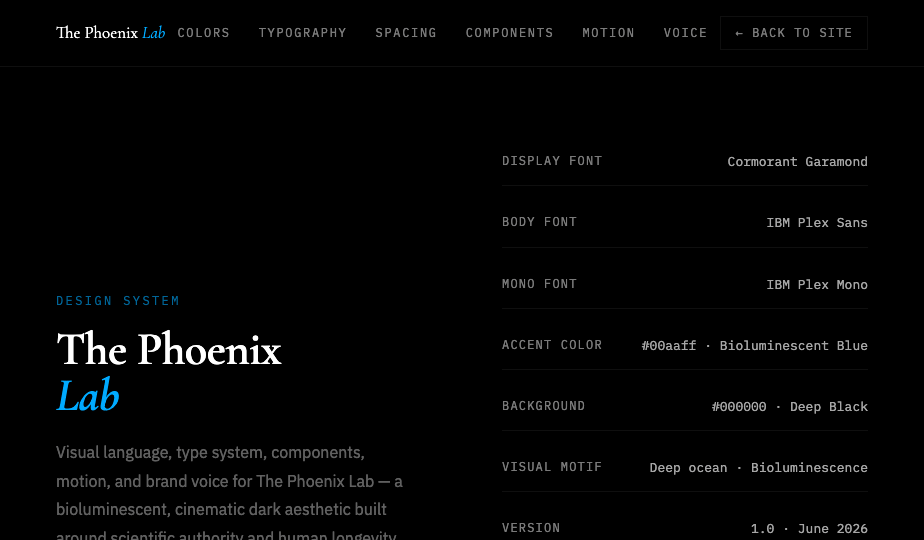
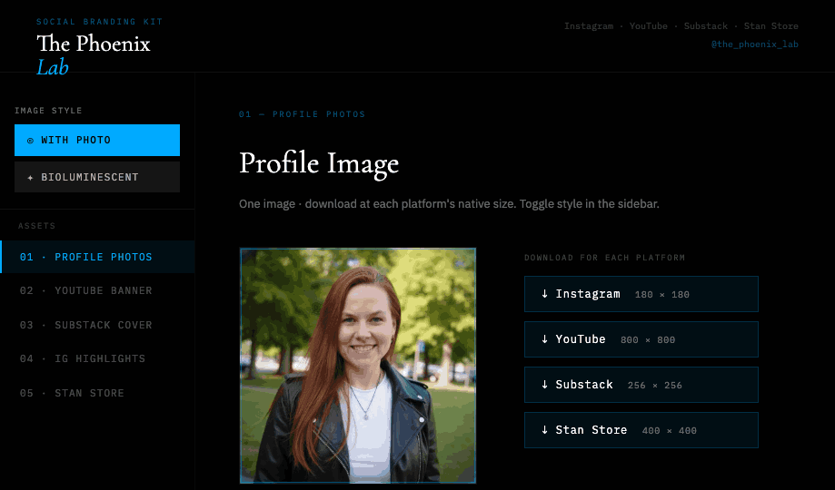
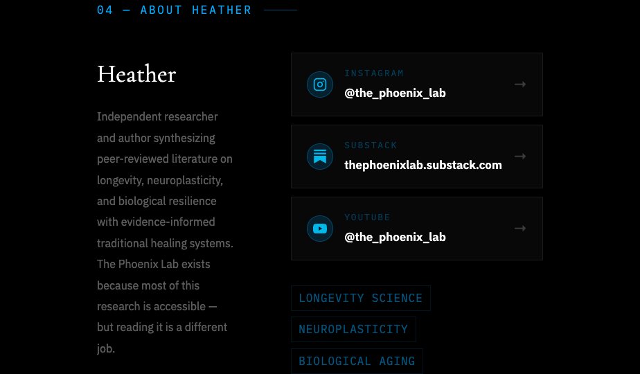
Six connected surfaces, built and handed off — the same review grid Heather sees on the live site, rebuilt here as the project's deliverable set.
I set the art direction and made every call. AI collapsed the distance between an idea and something Heather could react to — and let a one-person studio move like a team.
I directed the bioluminescent, four-layer look; AI helped me pressure-test the motion approach and optimize the video — lazy-loading per scene, slowed playback, off-screen pausing — so a film-heavy site still opens fast on a phone.
From my strategy and Heather's voice, AI drafted the Day 0 / 3 / 7 nurture emails — the science-honest tone, the one-protocol-at-a-time pacing — leaving me to edit and sharpen rather than start from a blank page.
To leave the client independent, we produced a setup guide, a living design system, and downloadable source for every page — so Heather can connect forms, hold the brand consistent, and edit without me in the loop.
A brand isn't a homepage — it's every surface staying in character, from the first scroll to the last email.